
Making daily complexity feel manageable.
Phil was developed specifically for France, bringing the many decisions involved in managing Type 2 diabetes into one connected experience without adding to the burden of daily care.
Phil brings nutrition, meal planning, activity, connected glucose meters and health reporting into one digital health experience.
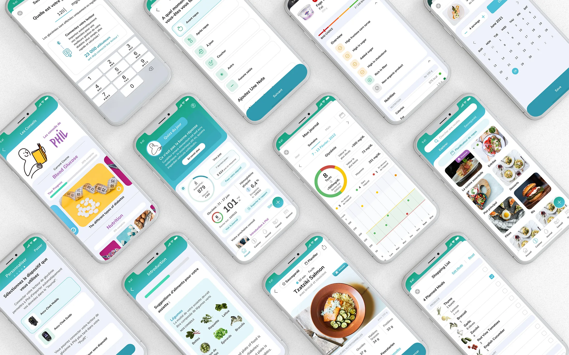


Phil was developed specifically for France, bringing the many decisions involved in managing Type 2 diabetes into one connected experience without adding to the burden of daily care.
Interviews with patients, dietitians and healthcare providers established a consistent direction: make the product easy to understand, trustworthy in tone and useful in the small decisions of everyday life.
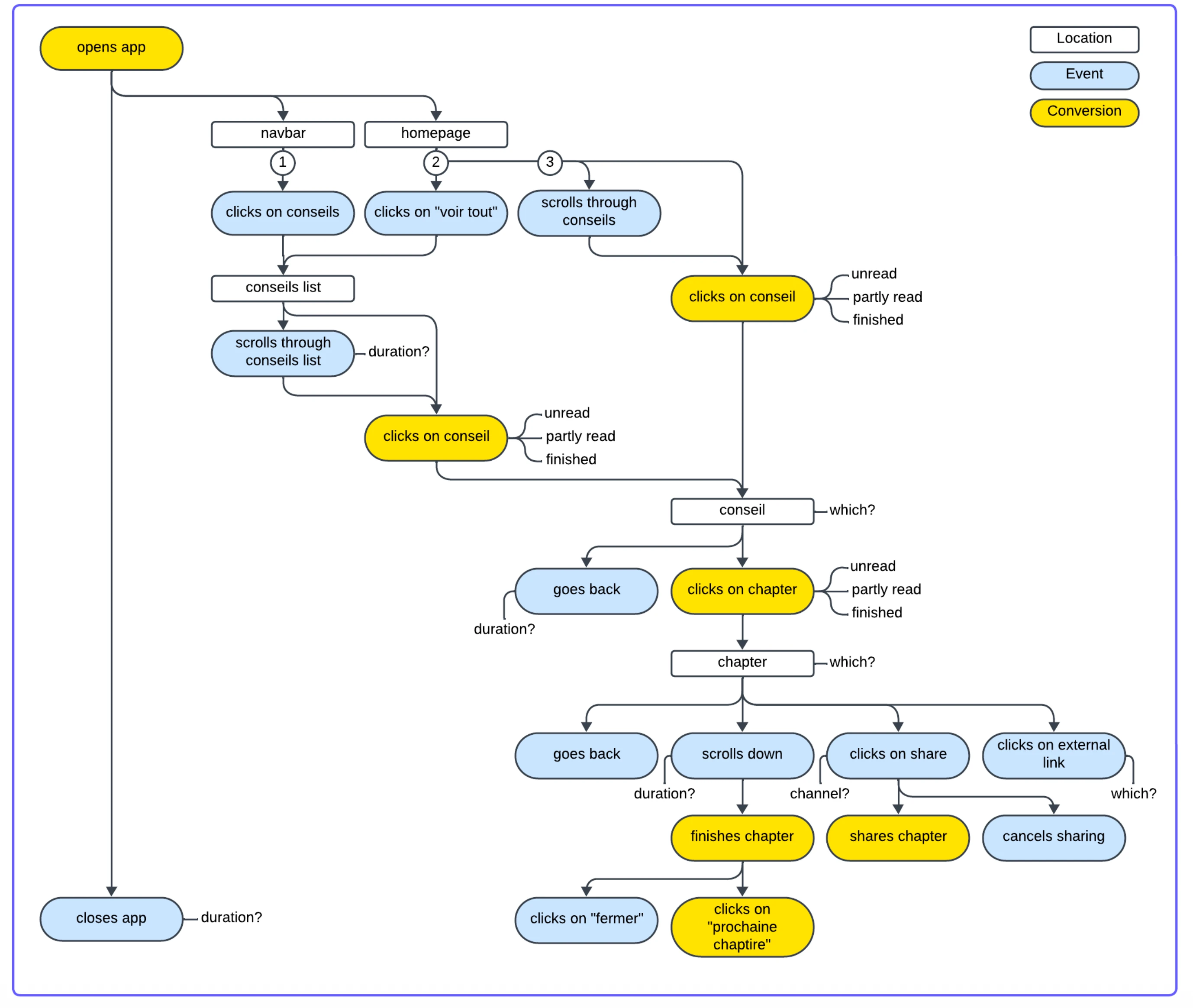
Patient and provider interviews, paired with behavioral event mapping, helped identify moments of uncertainty, information overload and friction across daily diabetes management.
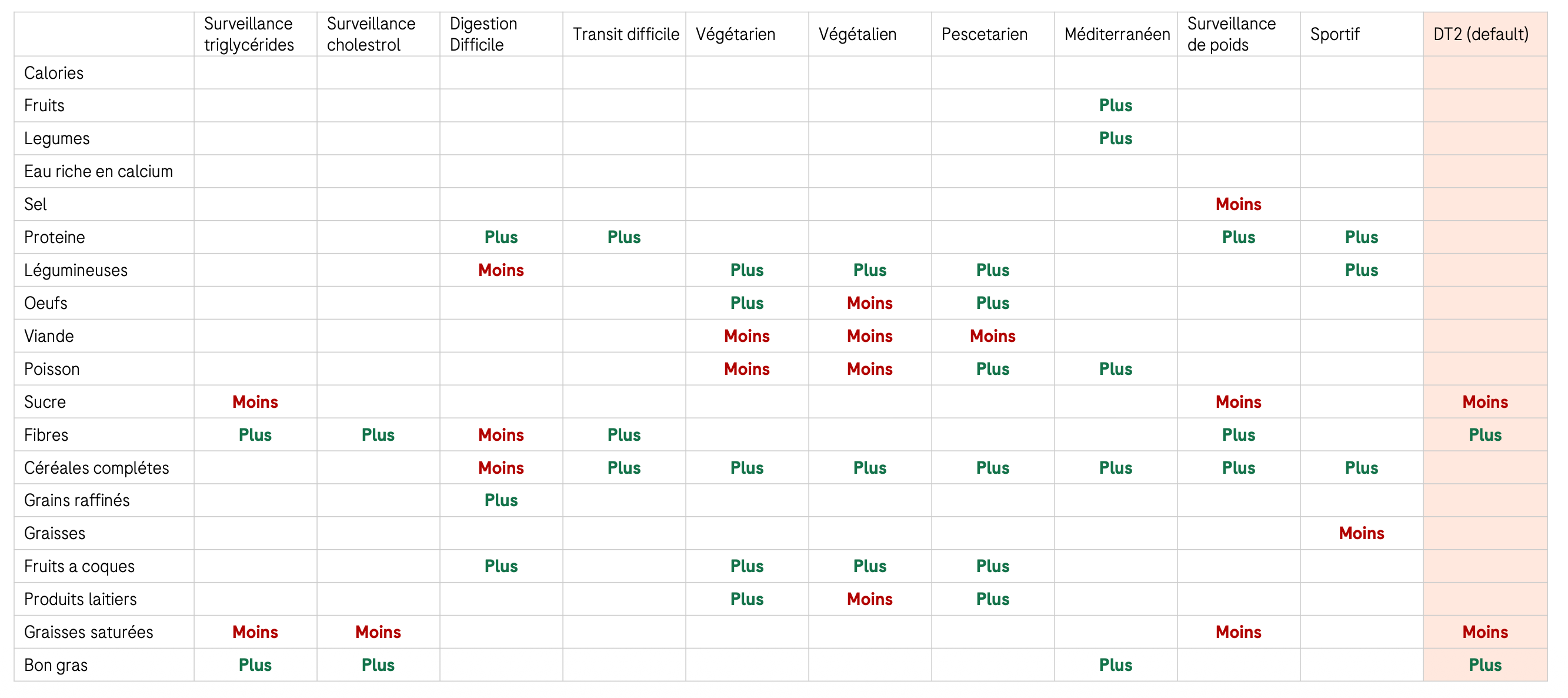
I worked with clinical and nutrition teams to translate diabetes guidance into a data model, mapping how each health context should increase, reduce or preserve specific nutrients and food groups.
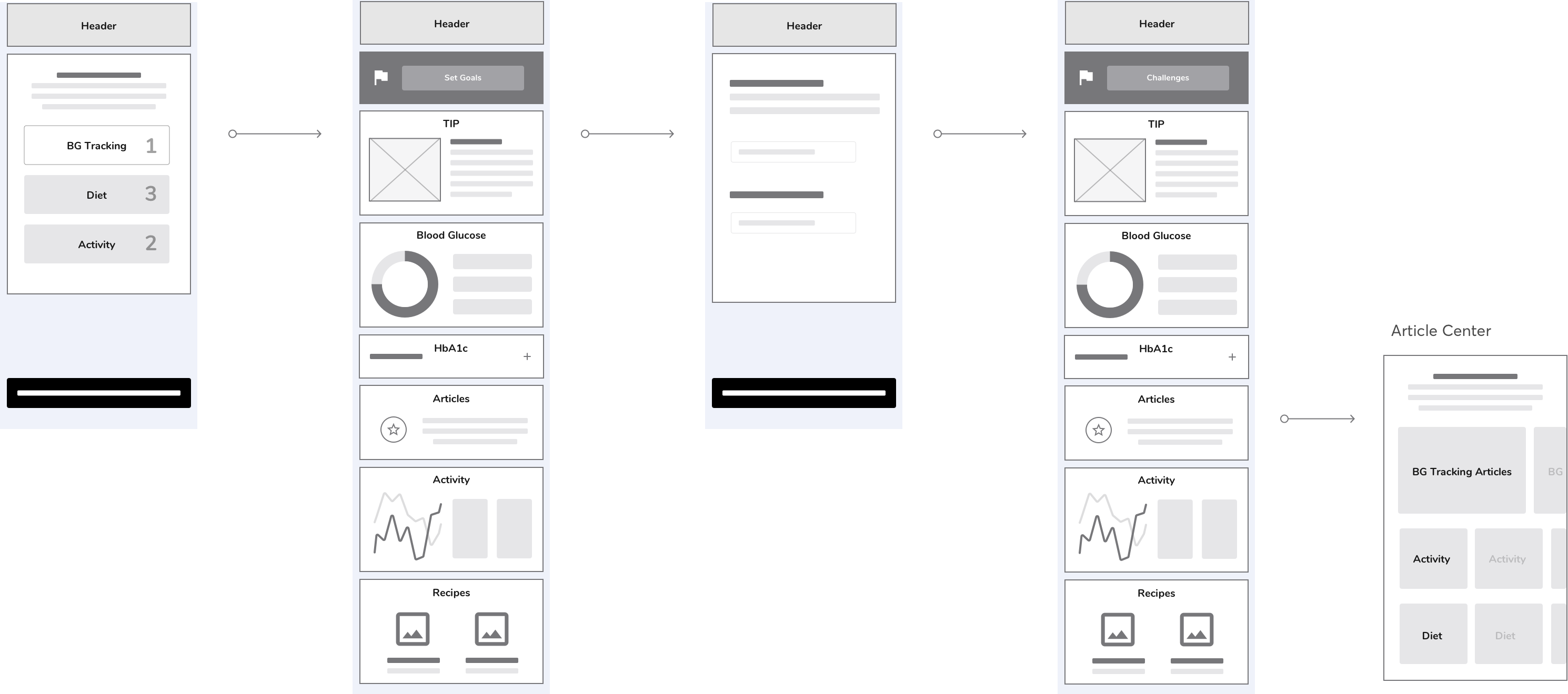
I mapped product flows, built prototypes and tested them directly with patients before moving into high-fidelity UI.
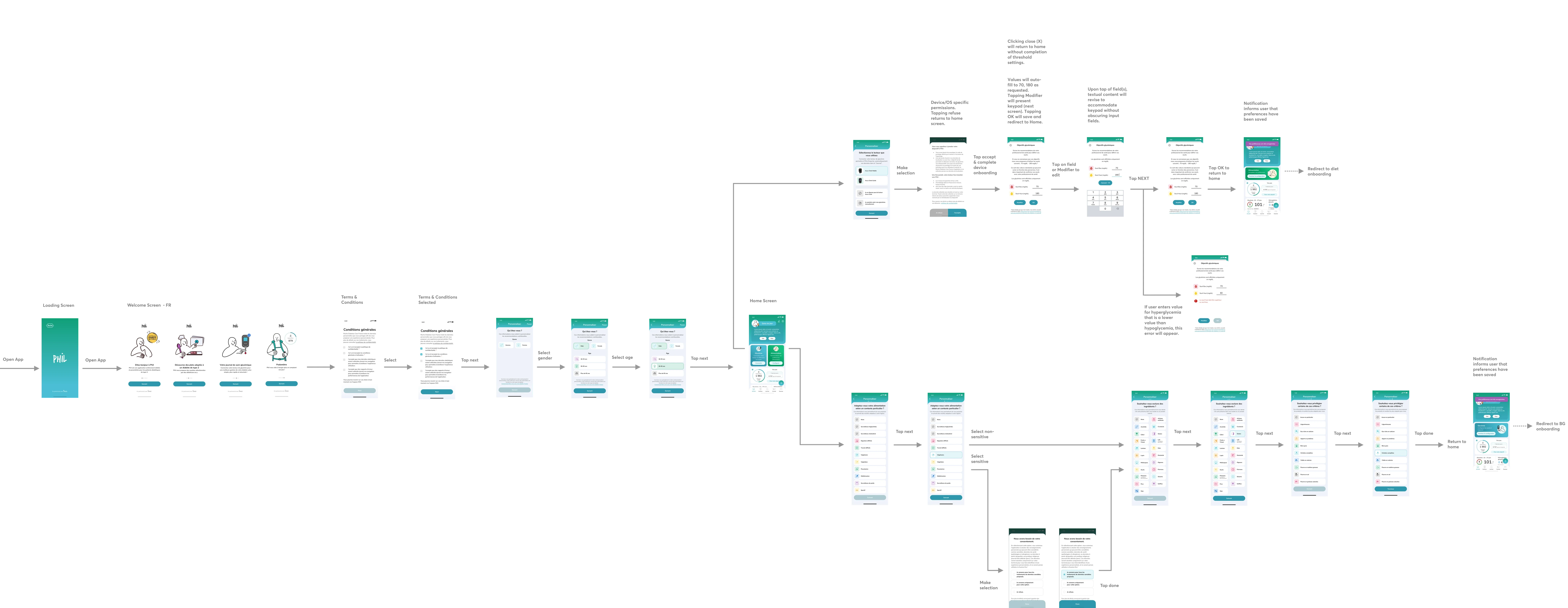
The final design system needed to flex across nutrition, activity, glucose and reporting without making each feature feel like a separate product.
The product architecture and relevance model turned individual features into one connected system, with a shared home, context and priorities that adapt to the person.
One feed surfaces what matters now.
Recipes · meal plans · shopping
Articles · quizzes · guidance
Glucose · activity · progress
Journal · scanner · quick tasks
Home is the front door. Product areas do the work. Each completed action updates what Home shows next.
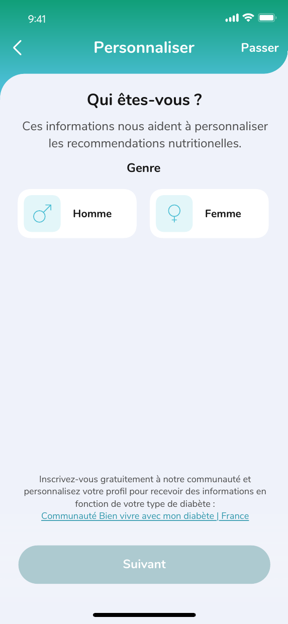
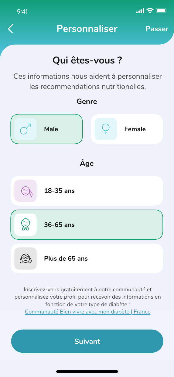
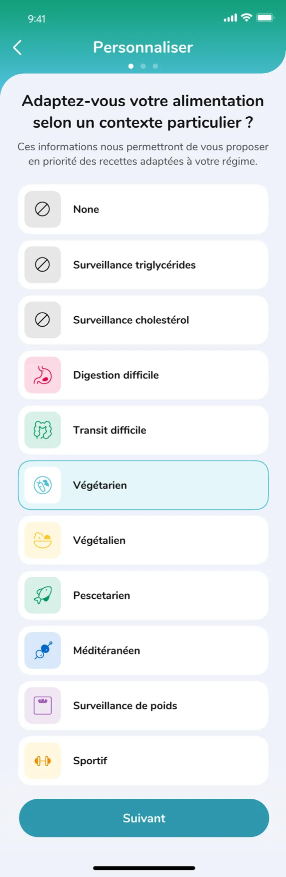
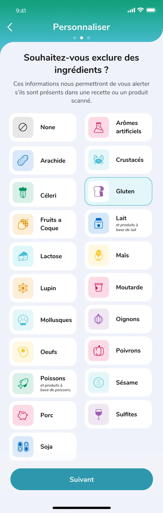
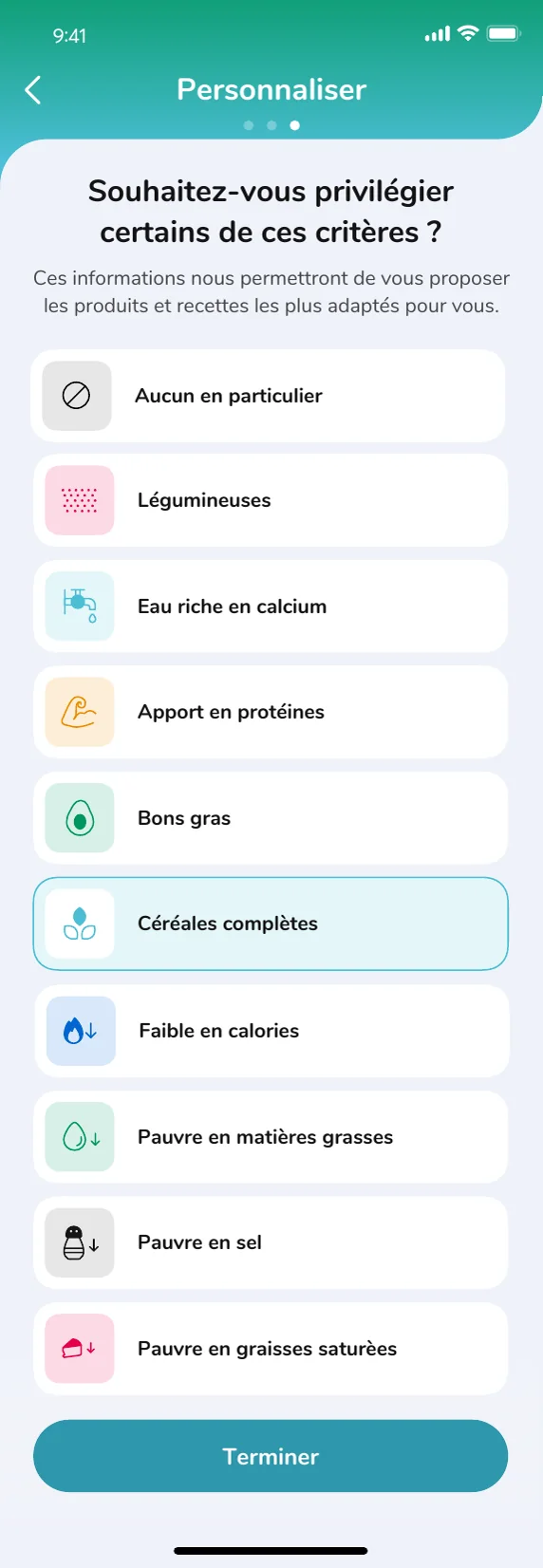
A card-based onboarding flow replaced long forms with conversational steps, clear progress and focused inputs. The experience gathered only the information needed to personalize the product, helping users reach useful content without setup fatigue.
Recipes adapt ingredients, portions and nutrition values to each health profile. Meals move directly into planning and shopping, creating a practical path from recommendation to action rather than stopping at inspiration.
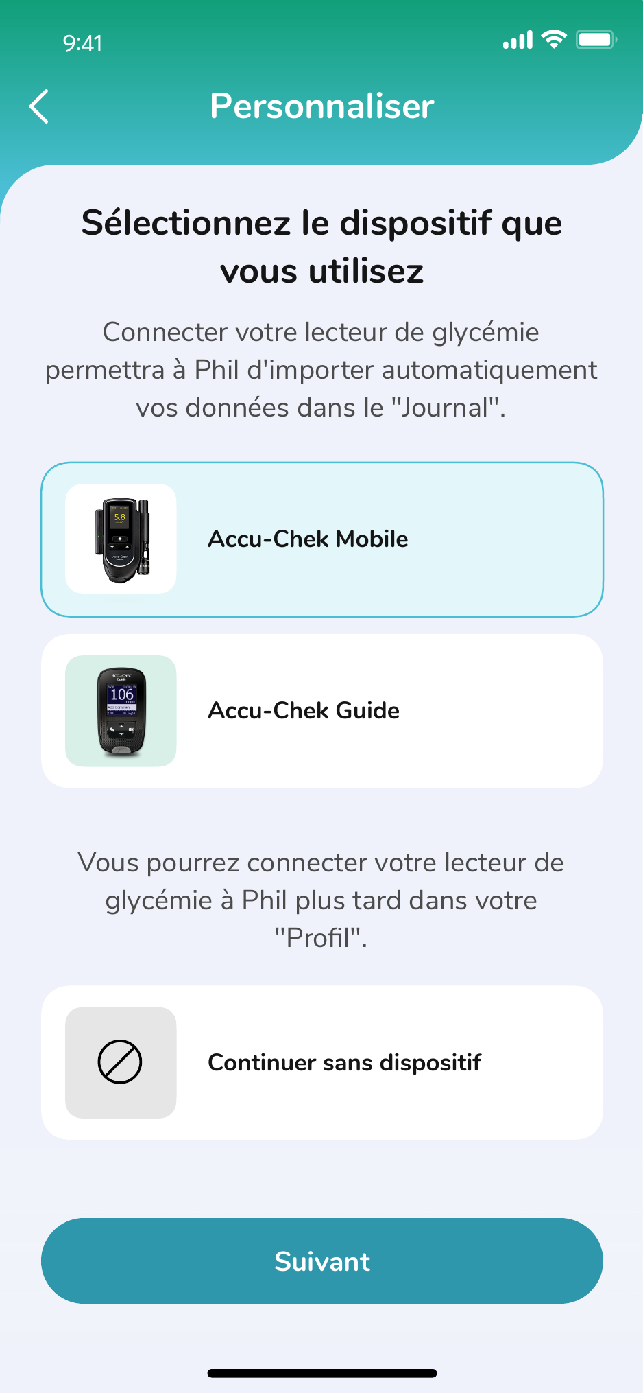
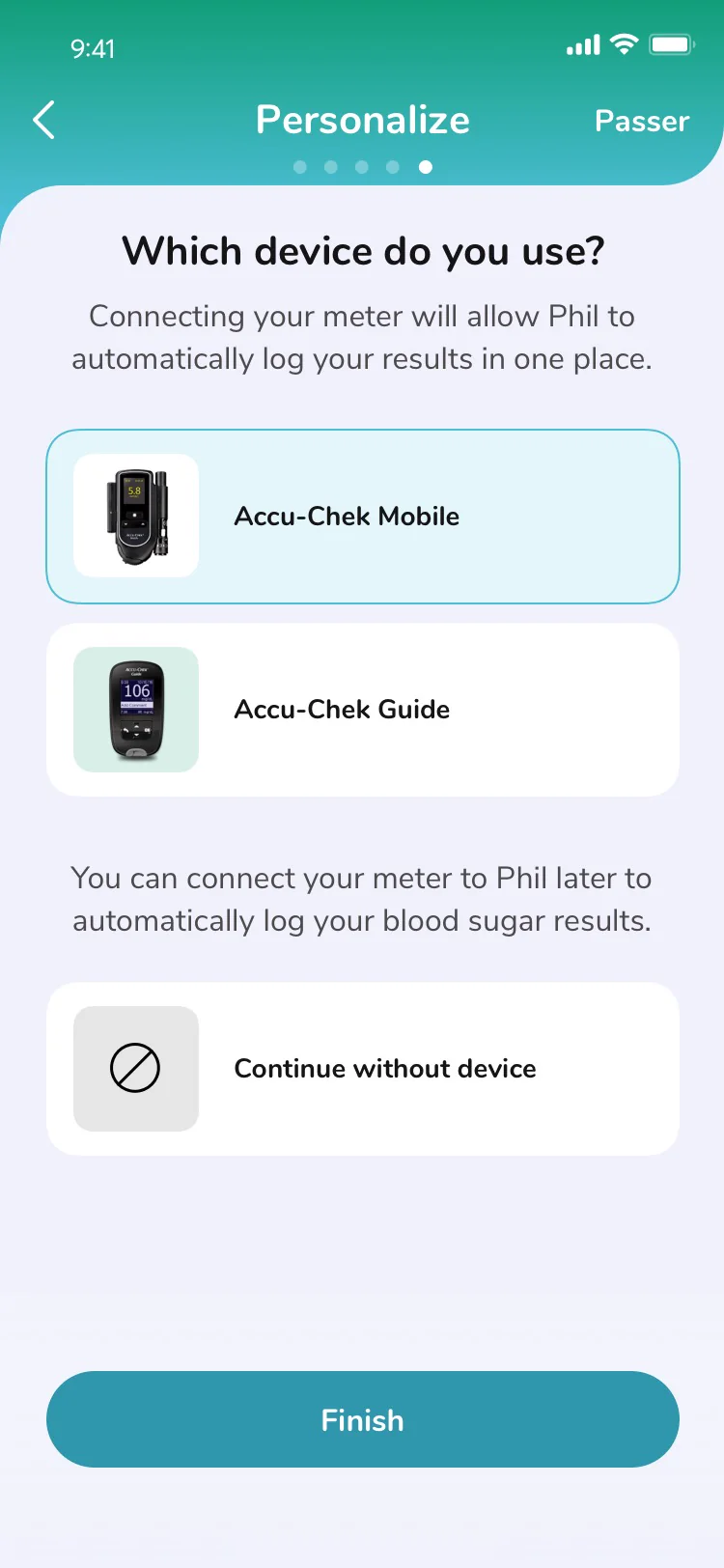
Connecting a glucose meter sounds simple. In practice, it was one of the most confusing moments in the experience. The existing instructions made sense from the device's point of view, not necessarily the user's.
The user chooses Accu-Chek Mobile or Guide.
Find serial, attach adapter and power on.
Open wireless settings and enter pairing mode.
Phil searches for nearby compatible meters.
Match the serial number or enter the PIN.
The first reading confirms a successful connection.
Keep the selected meter and preserve progress.
Check power, pairing state or reset.
Return to step 03, not the beginning.
The revised flow worked well enough that Roche updated the printed instructions included with the glucose meter to better align with the experience we had designed. What started as an interface problem became a clearer way to explain the product itself.
A connected Type 2 diabetes workflow moved data from the meter into a journal people could understand, then translated patterns into HbA1c history and a report ready to share with a care team.
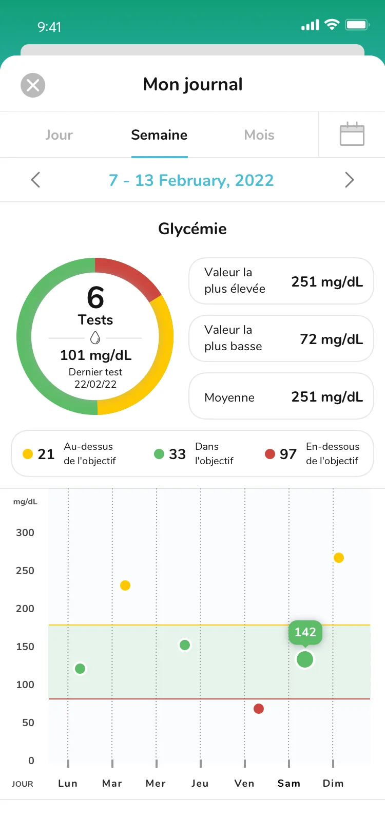
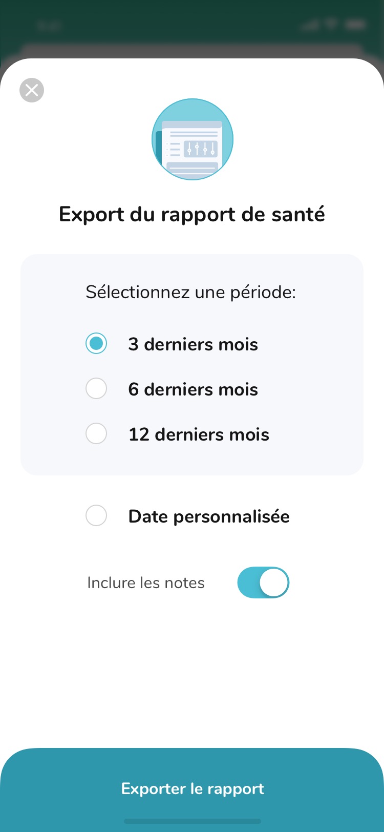
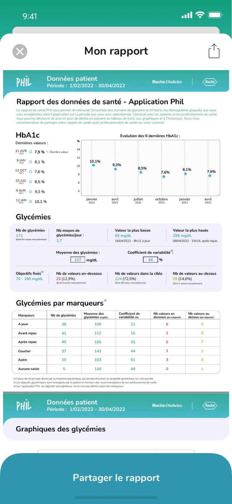
The journal walkthrough shows how individual readings become a useful history, giving people clearer context for daily decisions and care conversations.
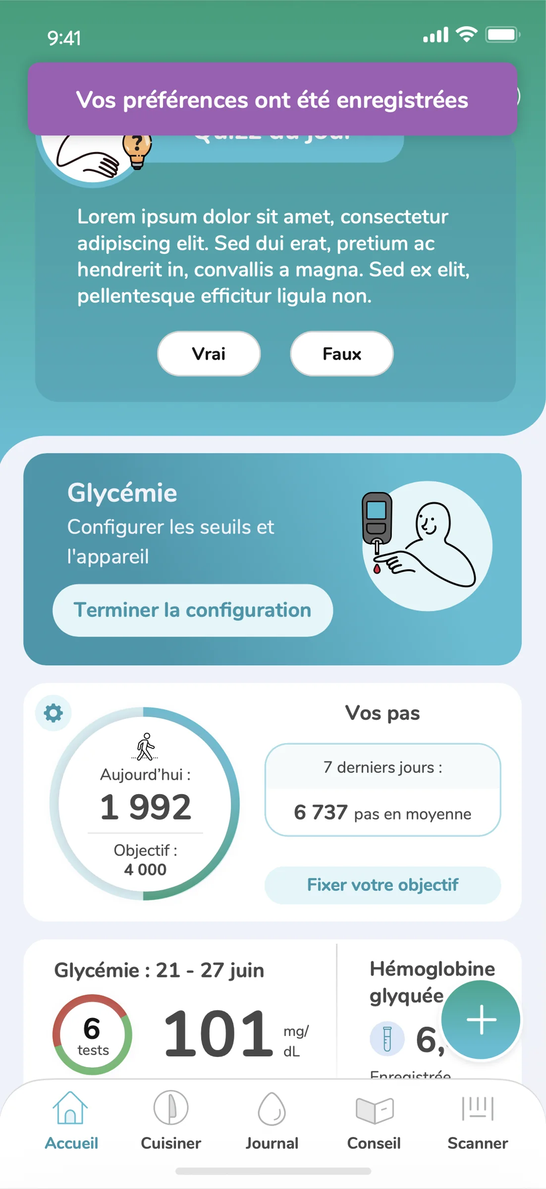
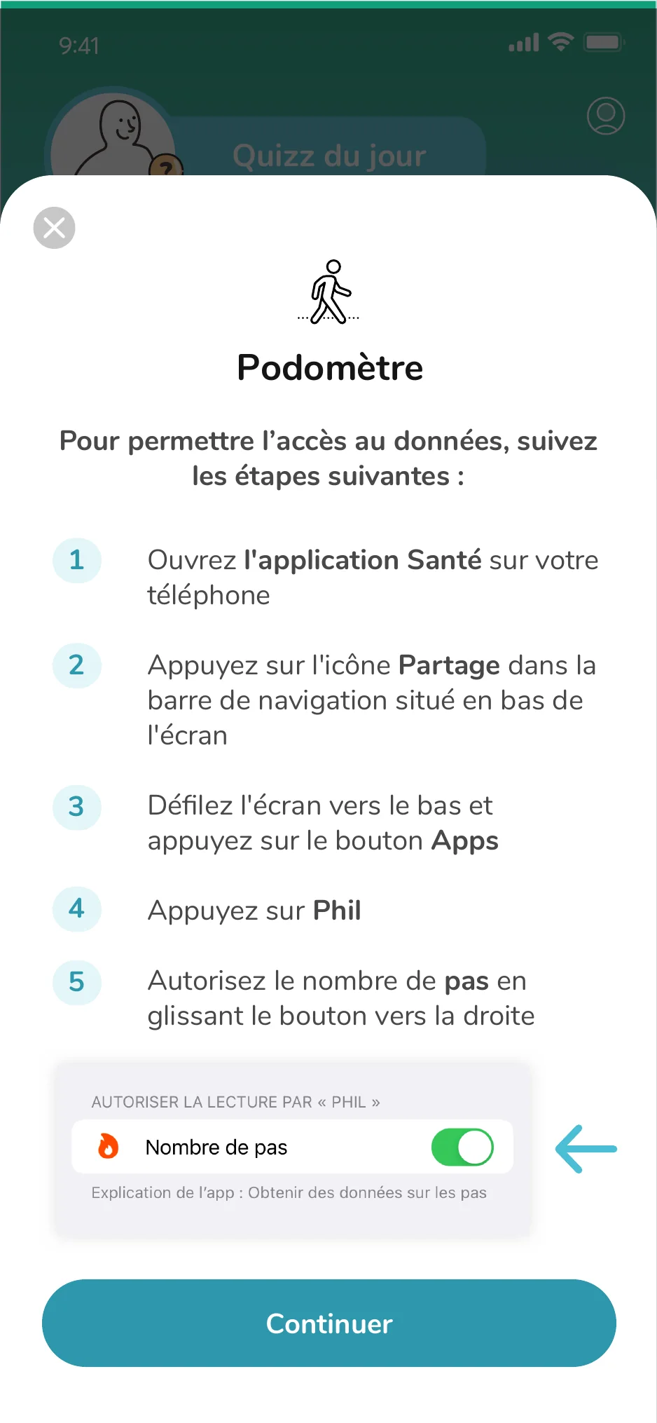
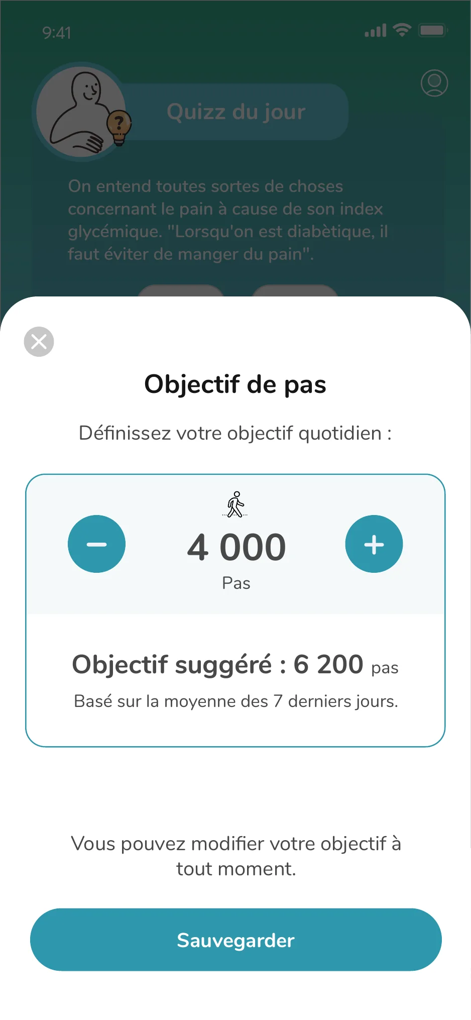
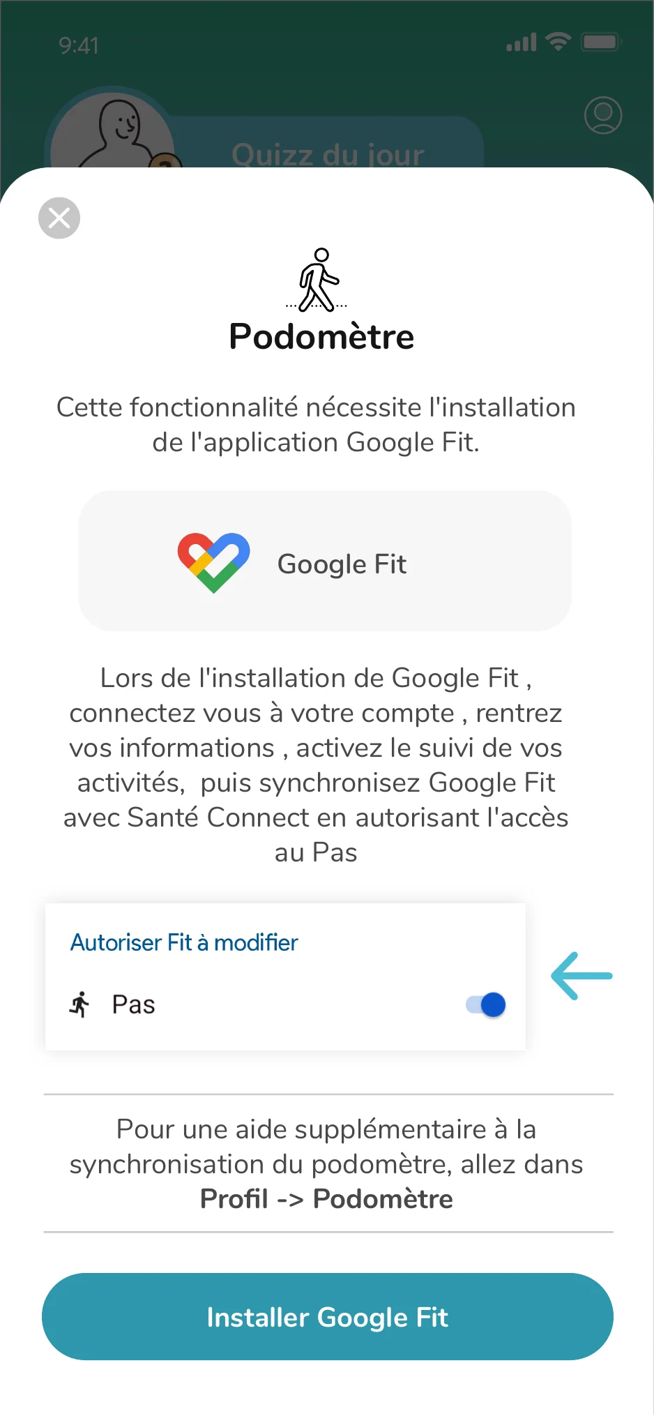
The pedometer was more than a step counter. It introduced a new behavior, negotiated health-data permissions, translated movement into a simple daily goal and provided a clear recovery path when the connection broke.
Progress that is visible at a glance, without creating another dense health dashboard.
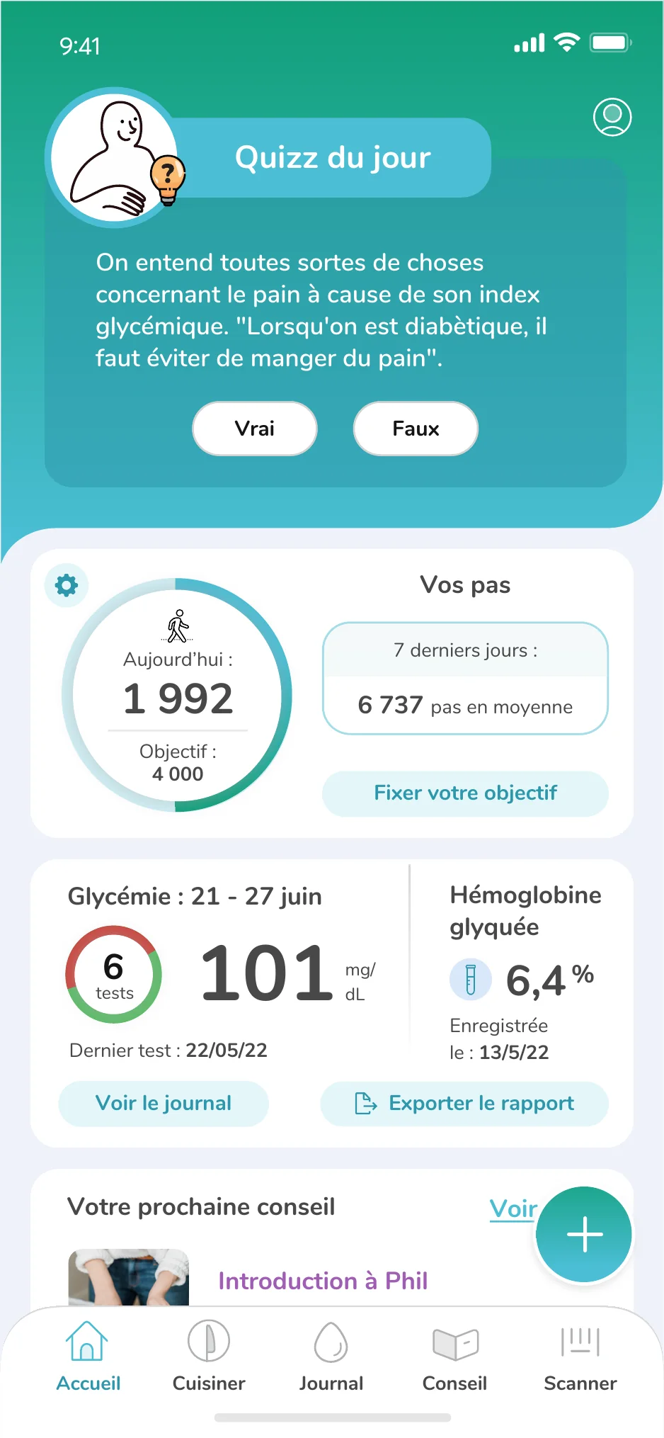
A completed ring and a restrained moment of celebration reward progress without gamifying health.
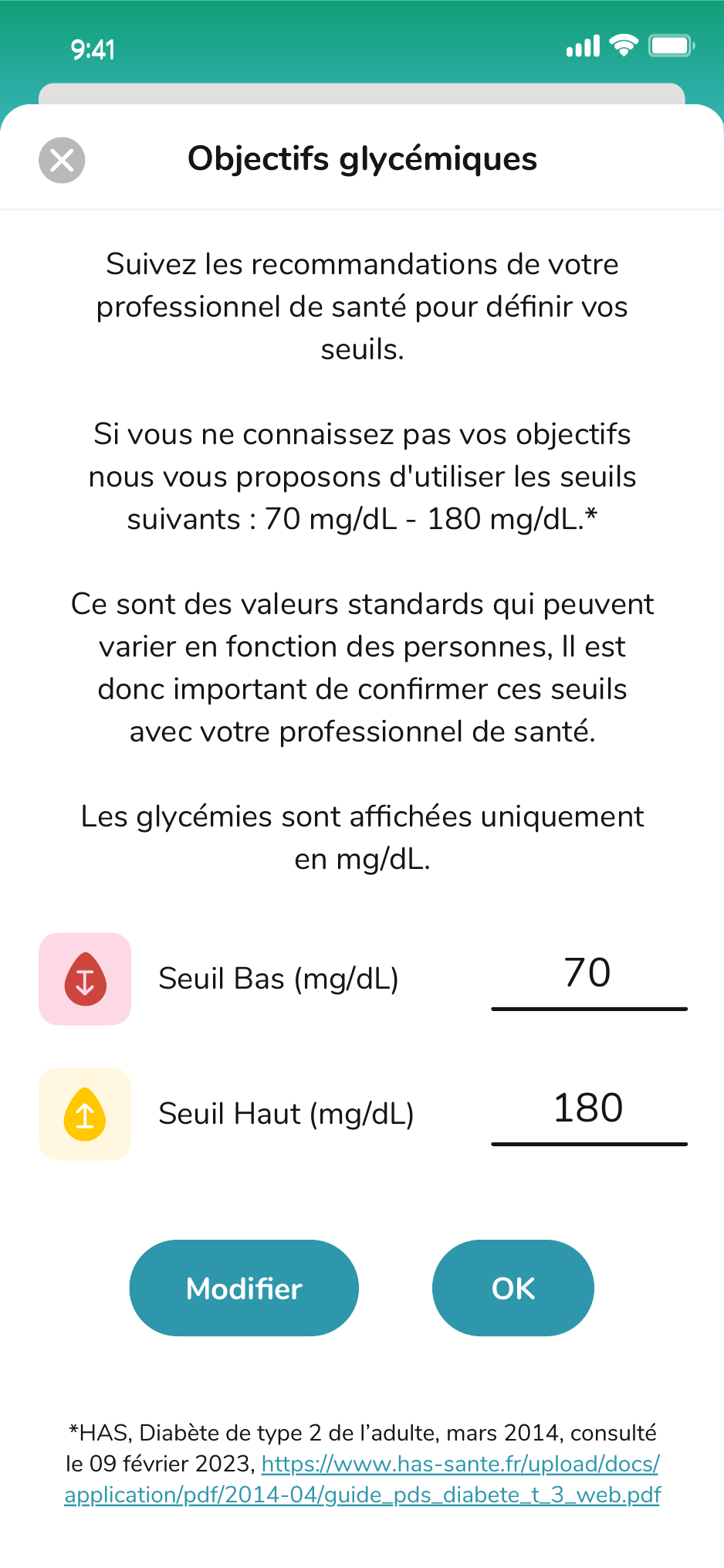
Suggested targets provide a useful starting point, while the user remains in control of the number.
Settings and troubleshooting turn a fragile OS-level connection into a guided, recoverable flow.
Phil was designed as a calm, capable companion who could explain, encourage and occasionally bring levity to a clinical experience. The character flexed from quiet utility to expressive storytelling without competing with the task.



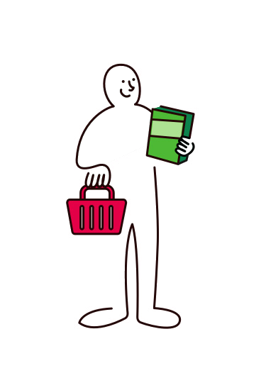
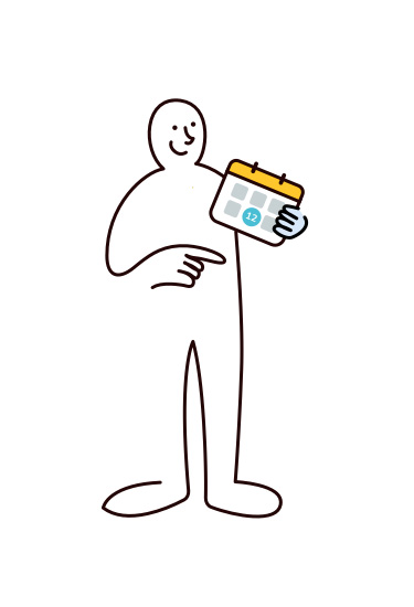
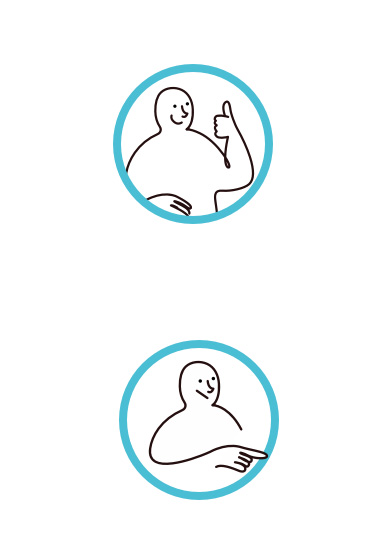
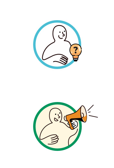
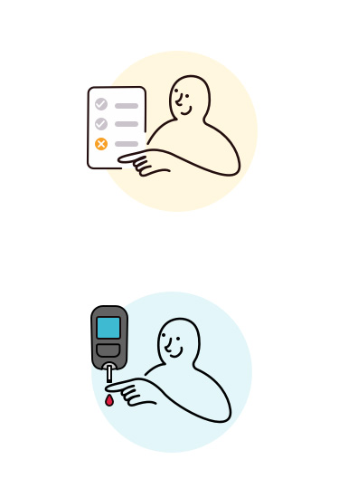
Phil introduces new health concepts before the interface asks for a decision.
Props turn abstract guidance into cooking, testing, planning and scanning.
Expression acknowledges uncertainty, errors and recovery without adding alarm.
Small gestures and purposeful color reward momentum while the task stays primary.
Phil brought recipes, shopping, activity and glucose tracking into one connected experience, giving patients a product they could use with confidence while maintaining the precision clinicians needed.
For patients
Clearer daily guidance, connected data and less friction between planning, action and understanding.
For Roche
A scalable design foundation for expanding digital health services while maintaining consistency and clinical trust.
“Scott’s dual strength, product leadership combined with design excellence, makes him uniquely effective in his role.”Vikram Natarajan